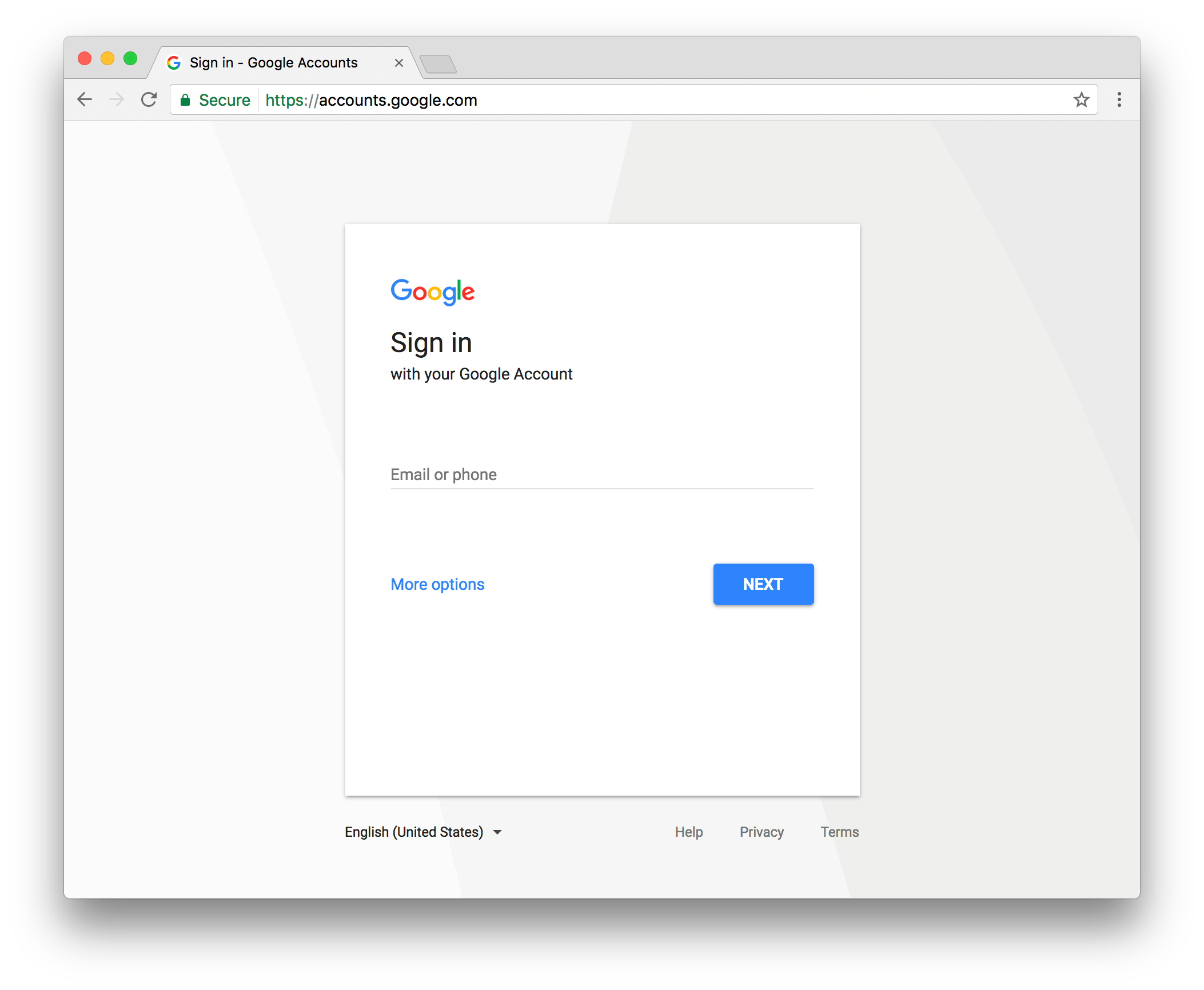
Google is the most used search engine in the world, and most users who use it have an account to synchronize the information of their searches or to access certain services like Gmail, Google+, Google Drive, Google Photos, etc. And even though the company has been using the same design for its login page for several years, today it has officially moved the new design of this page around the world.

The first thing to note is that there seems to be less information on the page, so the interface is cleaner and more pleasing to the eye, however, it is just as useful as the previous version since you can enter your e-mail or phone to be able Access your account.
The reasons why Google has made this change, in the words of the same company, is because they wanted to keep the login experience simpler and clearer, making the access process faster by having a consistent design across different devices Such as phones, tablets and computers.
One of the important reasons for this change is also due to phishing, or theft of information through fake websites; In fact the Google login page is one of the most phishing suffered, so the company led by Sundar Pichai insisted both users to verify the website they entered, and also kept the verification in Two steps.
After a couple of weeks of testing, Google has released this new login page worldwide, however the company mentions that it may be possible that it may not yet appear on certain devices if you are using an older version of our browser , Or, if Java Script is disabled, if still meeting these two requirements does not appear the new page will only be a matter of waiting a few hours or days for all users to see this update.
We’ve been reviewing multiple browsers, and at least in the mobile version, it’s already possible to access the new Google sign-in page if you add a new Google account to your phone, or if you link your Google account to start Session of a third party like Spotify or Deezer.


