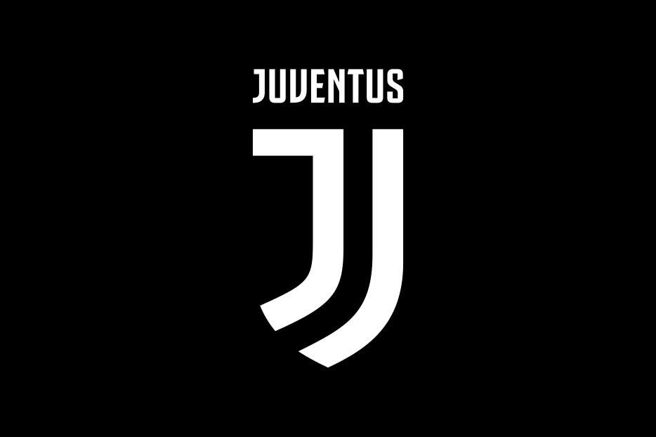
On Wednesday 18th the top rated Italian football giants announced a ground breaking important event in their football career, that they had a new logo to replace the old existing one.
Juventus have unveiled their new logo… What on earth was wrong with their previous one?! pic.twitter.com/5h3EhvLqsy
— Coral (@Coral) January 16, 2017
But this did not go down with most of the fans across the world, including some of the fans who are supporting Juventus.
They expressed that the new logo was a mere work of a lazy person who did not want to think so hard.
This argument stood out with the purpose of the logo which was meant to be simple for it to stand out among the usual shaping of a logo.
Some of the fans argument are as follows.
#Juventus just dropped their new logo. Take a look back at the kits & crests of the #bianconeri. pic.twitter.com/Tg9dZ2J8Rn
— COPA90 US (@Copa90US) January 16, 2017
You be the judge…look at how Juventus' new sleek logo stands out amidst an array of outdated, archaic crests. pic.twitter.com/nLuk5uzWQ0
— Cristian Nyari (@Cnyari) January 18, 2017
https://twitter.com/TrollFootball/status/821709227471216640
Juventus have unveiled their new logo… What on earth was wrong with their previous one?! pic.twitter.com/5h3EhvLqsy
— Coral (@Coral) January 16, 2017
I spoke to the man behind the new Juventus logo about appealing to fans who don't like football https://t.co/hw7LDHG9Gc pic.twitter.com/giivRsPwpG
— Hamish Mackay (@HamishMackay) January 19, 2017
https://twitter.com/FootballVines/status/822081186264743936
https://twitter.com/JuventusCrazy/status/821126976400306177


